 RECOGNITION
We are what we repeatedly do. Excellence then, is not an act, but a habit.
‘We are what we repeatedly do. Excellence then, is not an act, but a habit.’



Mrs. RATI GODREJ
Managing Director - Godrej Industries
“Behzad Kharas and his outstanding team of young and enthusiastic architects & designers at BNK have shown remarkable professionalism, creativity and hard work in renovating our family heritage home in Navsari. They have been delightful and a joy to work with on this project. They are always very sincere, respectful, and patient to understand all their clients’ needs, budget constraints and personal preferences.
I would definitely highly recommend their professional services for those planning architecture and design projects in the future”.

Dr. Sonal & Dr. Apoorva Shah
Doctor - Richfeel Trichology Center
We had a 35 year old dream. Dream of a house which could be called Home. The search to make this 35 year old dream come true... took us to Italy, where by sheer providence we got Behzad’s reference from three different people related to the interior world.
Rest they say is history and our dream Home was ready at Ahuja Towers. The sheer magnificence of our Home has floored all friends, relative, business associates and family. The best virtue of an interior designer / architecture is to see the world from the prism of the house owner’s eyes.
Behzad has the ability to see through the prism and create the awe inspiring experience. Today Behzad is a family to all of us.

Mrs. Gayatri Ruia
Director - Pheonix Mills
“Behzad and his team have worked with me for the PIP programme at the St. Regis hotel. He and his team were able to understand my vision and design intent to be delivered and have done so to my satisfaction.
The BNK team showed great work ethic and integrity and I wish them success always.”

Mr. Hitesh Keshwani
Founder & Director -Silver Beach Entertainment and Hospitality India Pvt. Ltd
I absolutely love working with Behzad and team (BNK Interiors).
They are well coordinated, full of great ideas & carry out all activities with utmost professionalism. I get daily and weekly project updates on a regular basis which makes this entire process an incredible experience. To envision a client’s needs and translate that into reality can’t be easy, but they make it possible!

Mr. Maulik Sheth
Director- Sheth Group
"BNK group have partnered with us on two of our prestigious projects Sheth Zuri, Sheth Avalon and our corporate office. Behzad’s understanding of my point of view and his clear, focused high standards in design aesthetics made easy, fast, almost effortless project design. His plans were spot-on in terms of design, planning of space, colour palette – down to the last detail.With Behzad’s very capable and far sighted approach, the entire team works exactly as it ought to; and the results are here for all to see. They were able to translate our thoughts into a concept and eventually deliver this concept as a truly wonderful experience at both the projects! Architect par excellence, Behzad’s personal involvement in each project and his understanding of customer need make it a sheer delight to work with him. The best space planner who is constantly evolving with the changing trends of the design industry.
We at Sheth group take immense pride in being associated with the BNK Group and look forward to many new such accomplishments together!"

Mr. Pappu Wasan
Chairman-Wasan Group
Dear BNK team,
You’ll have done a lot of work for me at various locations and I am extremely happy and satisfied with the outcome each time. Behzad’s designs are phenomenal and extremely trendy and the quality of work is also extremely high.
Overall I have always been happy with your work style and quality. Superb Job!

Ms. Reema Diwan
Former AVP Technical Services - IHCL
Director - Technical Services Accor Group Southeast Asia
Endured a fabulous journey with BNK while establishing interior designs for Vivanta Vashi. Design voyage was started as Gateway Hotel and was later remodelled as Vivanta Hotel. Interior design was recreated with fresh lenses staying true to the brand, delivering brand ethos. The outcome of design was impeccable. I am in awe of the design abilities illustrated by Behzad. He is innovative and responsive with a vision to deliver cohesive experience. Secrete to a successful design is execution and his understanding of execution give an extra edge in delivering the designs virtually. Thanks for your fantastic design works!
 TEAM
TEAM
‘Our team is committed to excellence. Join our team and be a part of our elegant family.’
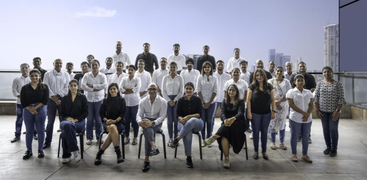
At THE BNK GROUP, we believe in delivering a project keeping in mind the client’s personal philosophy, needs and tastes and transforming these ideas into an end result that displays great quality & seamless execution.
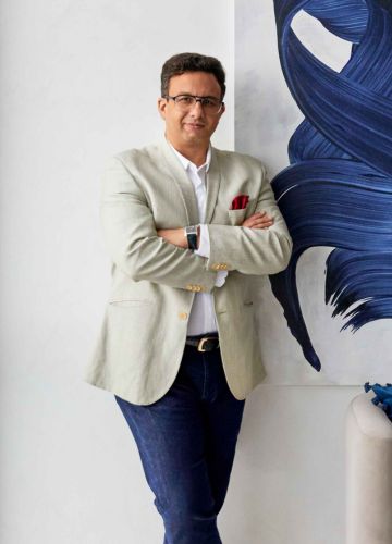
Chairman & Managing Director
Mr. Behzad Kharas, Chairman & Managing Director of The BNK Group, spearheads the organisation from its Mumbai office.
Renowned for his multidisciplinary approach, he has the ability to seamlessly integrate various aspects of a project from designing to execution. Behzad is not only known for his design and execution capability but also for his inspiring entrepreneurial journey which has seen success and failure and his unique capability to overcome any challenge that comes to him, whether in life or on any project.
Over the past 20 years, Behzad has driven The BNK Group to a high point by crafting high-value spaces and delivering designs for over 500 projects. Driven by an unwavering commitment to impactful design, Behzad's mission is to enhance lives through innovative spaces and helping his clients realise their dreams to reality. Guided by unwavering values, he garners the loyalty of repeat clients who trust him and the team to deliver against all odds. Behzad's tireless work ethic and indomitable spirit have solidified The BNK Group's reputation as an esteemed player in the interior and architecture design domain.
Beyond his professional pursuits, Behzad finds solace in his passions for cars and watches. A connoisseur of fine dining, he embraces life's pleasures and cherishes moments spent with his family. He personally believes in being humane, honest & humble.

Co-founder and Managing Director, LINK-BNK
Having enjoyed a thriving career as a Bollywood actor, jewellery designer and a passion for creative arts, interior design naturally evolved into an extension of Neelam Kothari Soni's identity.
A fervent enthusiasm for the finer things in life led Neelam Kothari Soni to explore the world of jewellery design alongside her father, offering a wellspring for her creative thirst.This process of transforming gems into exquisite works of art ignited a deeper designer's passion, compelling her to pursue more and that is what led her to the interior design space.
Neelam is known as a woman who successfully juggles between her role as a professional and as a homemaker, mother and daughter. She is also one of the most sought after speakers at national and international events where other women seek inspiration from her for managing so many roles in her life uncomplainingly. Her humility in spite of being a celebrity is what drives her clients to keep coming back for her expertise
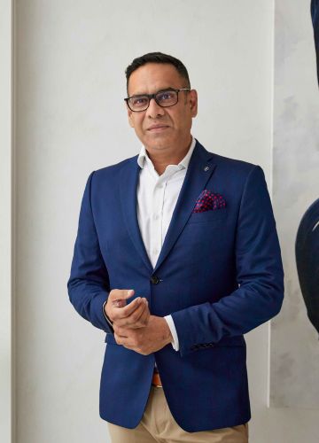
Co-Founder and Managing Director, K- BNK
Drawing upon 22 years of architectural knowledge and practice, Kshitij Limaye blends artistry into his expertise and has adeptly overseen a multitude of projects, spearheading a team of gifted designers.
Renowned for his astute analytical acumen, he diligently endeavors to comprehend clients' aspirations. Sustainability stands as a cornerstone of his craft. While the art of sketching remains an intimate passion, he firmly believes it breathes life into his magnificent projects. As a distinguished consultant who effortlessly integrates global design influences into his projects; he specializes in curating dynamic commercial workspaces infused with innovation. With a wealth of experience, Kshitij's portfolio spans several popular global conglomerates.Beyond his creative and strategic acumen, he excels in client acquisition, management, and crafting sustainable concepts.
His designs unite creativity with sustainability, striving to fulfil diverse aspirations. With efficient design and build solutions, Kshitij offers consultative diligence for project objectives, establishing him as a coveted architect in India. Beyond his professional endeavours, a love for photography and music propels his journey for excellence. He utilises tech tools to translate his visions into tangible designs.
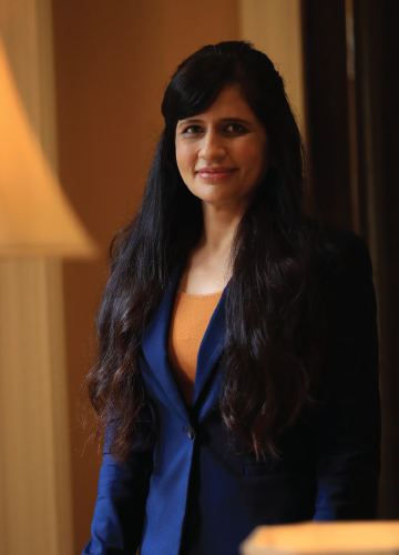
Director – Design Division
Hitissha's 20-year design career touches celebs like Shilpa Shetty and corporates, enhancing each project. Formerly leading Mumbai real estate interior design, she's a fitness and cycling devotee. Her skillset expanded the Group's design spectrum, embracing diverse styles.
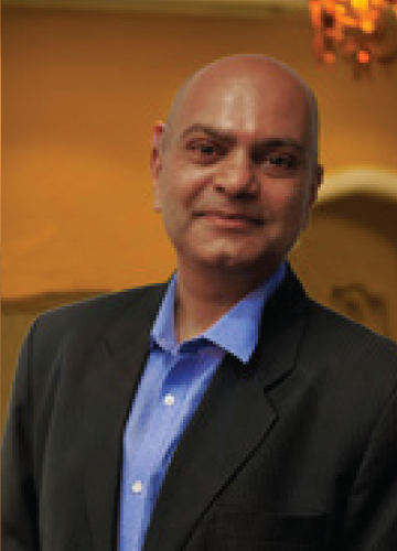
Director - Contracts Division
With 25+ years of expertise and a NICMAR Project Management degree, Harshal Patel focuses on seamless communication and detailed documentation. Overseeing varied projects, from boutique interiors to expansive townships, his passion for macro photography adds a creative dimension. Swift execution is his design essence.

Executive Director
Anahita excels in her role, driving back-end operations with her Master's in HR Management. Her expertise spans travel coordination, event management, administration, and HR responsibilities. An avid reader and music enthusiast, Anahita thrives on tackling challenges head-on.
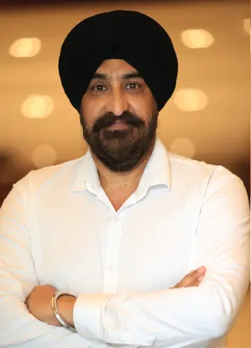
Joint Director - Contracts Division
Joginder Rainu, with 20+ years in luxury residential design, brings meticulous attention to detail, enriching BNK Group. His passion for cinema enhances his approachable, knowledgeable persona, adding to the team's versatility.
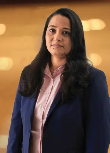
Chief Financial Officer
Kavita is a seasoned chartered accountant with an impressive track record in mergers and acquisitions, distressed asset resolution, and financial analysis. With her independent practice and extensive association with the group, she has established a robust financial framework, steering the group's growth.
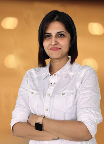
Head HR & Administration
Chaitali turned her aviation dream into reality after her BA graduation, flying for global and domestic airlines. Her talent for building teamwork and unity stems from a hospitality foundation. Beyond work, her love for animals fuels her pursuits, alongside her passions for reading and travel.

Sr. Designer - Design Division
A skilled and creative interior designer, boasts 13 years of experience in residential and corporate interiors. Her adept problem-solving and quick-thinking abilities shine through. Her design sensibilities are enriched by her passion for travel and dance.
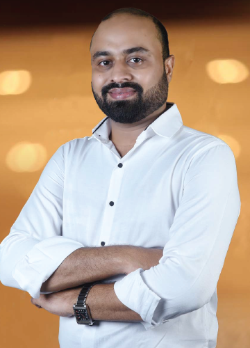
Sr Designer - Design Division
An exceptional interior designer specialising in personalised and functional spaces for clients. Karan is an expert in residential and commercial projects, excelling in space planning, detailing, and flawless execution while adding exceptional value to our company.

Sr Designer - Design Division
Sanjay boasts 10+ years in interior design across residential, hospitality, and retail. Detail-focused and valuable, his diverse expertise elevates the team. An avid solo traveller and food enthusiast, his passions amplify his creative prowess.
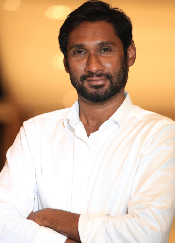
Sr. Project Manager - Contracts Division
An interior designer by profession, Farukh's inclination to handling turnkey projects and developing a strong suit to plan and execute projects, has made him a key member in the contracts division. His keen eye for detail, vendor and cost management makes him the perfect choice for leading the execution of projects.

Sr. Architect & Project Manager
Mihhiir Shah is an architect with more than 26 years' experience in the field of architecture and interior design. His designes have helped him achieve a practical and buildable solution fulfilling the client's requirements, aesthetics, mood and style, harmony with environment, ergonomics and most importantly being easy on client's pocket.
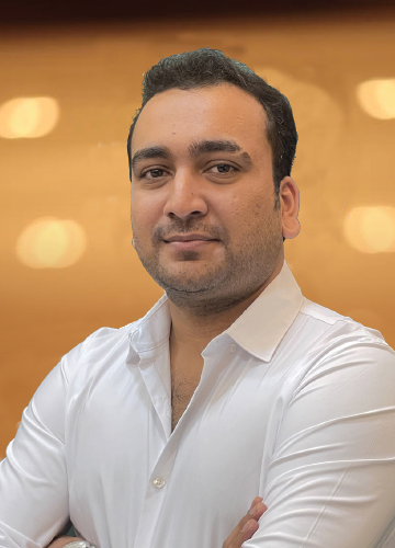
Sr. Project Manager - Contracts Division
A professional interior designer with a decade of experience in managing luxury residential projects make him a perfect match when it comes to building out luxury homes. His eye for detail and finish makes him a strong asset to the group's capability of handling difficult and inspiring details thereby creating new benchmarks for design and execution.
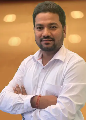
Sr Project Manager - Contracts Division
Bringing over 10 years of interior design experience, Yogesh excels with meticulous precision and unparalleled spatial visualisation. Infusing global influences from his well-travelled background, his positive demeanour and remarkable talent distinguish him.
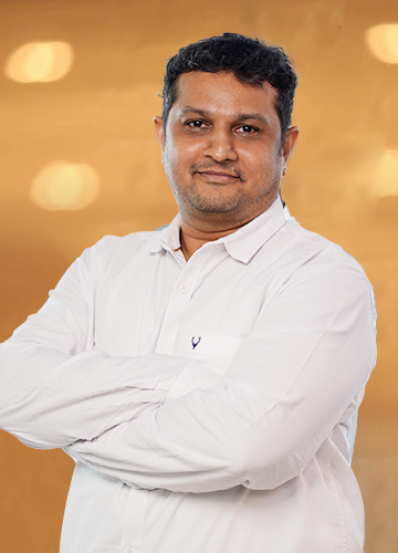
Sr Project Manager
With 20+ years of experience in designing and executing opulent residential and commercial projects, Abhay specializes in intricate design for excellent results. He embraces new challenges and is passionate about connecting and exchanging ideas for enhanced fulfillment in his work.
This show flat and sales office had to be designed for a reputed developer keeping in mind the mid budget young aspirational home buyer. The concept was to keep the design relative to the buyer by not doing an over the top design but by doing a design that even the buyer could achieve within his budget and not feel left out by seeing a fancy apartment thinking it wouldn’t fit the budget. A buyer centric approach to design was initiated with many space saving details featuring on the design. The project brand colours were kept in mind and a bright colour palette was evolved through the design. The sales office earlier was meant for the project but the developers later transformed the idea and wanted an office as their regional office for other projects in the area. The office was kept to international and universal appeal with use of whites and greys interspersed with luxury elements like gold lamps and details. The project recorded a highest sale in the region on the day of launch, thereby proving that the concept chosen was the right choice for the project.